


Web design plays a crucial role in ensuring a seamless user experience and engagement. With the wide range of devices available, it is essential to create websites that can adapt to different screen sizes and technologies. This is where responsive web design comes into play. In this blog, we will explore the key differences between responsive web design and normal design, the principles and technicalities of responsive design, its benefits, and its future in the world of web design.
What is Responsive Web Design?
Responsive web design refers to the approach of designing websites that adapt to different screen sizes, resolutions, and technologies. It aims to provide optimal viewing, easy reading, and navigation across various devices, including mobile phones, tablets, and desktop computers. The concept behind responsive web design focuses on creating flexible and adaptive web page layouts that respond to the user’s behavior and environment. By embracing responsive design, web developers prioritize user experience, ensuring that their websites are accessible and visually appealing across different devices.
The Concept Behind Responsive Web Design
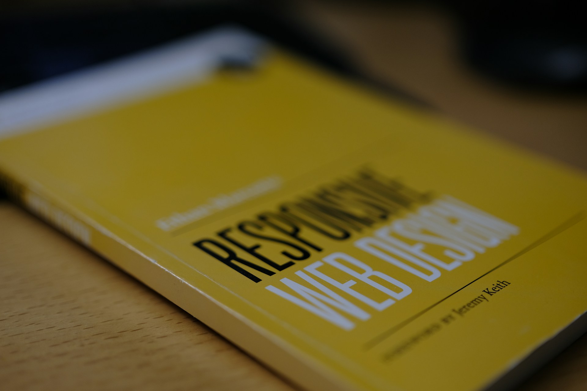
The concept of responsive web design was first introduced by Ethan Marcotte in 2010. It revolutionized the way websites were designed and viewed by acknowledging the fluidity of the browser window and screen size. Responsive web design utilizes fluid grids, flexible images, and media queries to create layouts that adapt to different screen sizes and devices. By using fluid grids, web developers can design websites that have flexible layouts. Instead of fixed pixel-based layouts, elements on the web page are sized in relative units, such as percentages, allowing them to adjust proportionally to the screen size. This ensures that the design remains visually appealing, regardless of the device used. Flexible images, on the other hand, are images that can scale and adapt to different screen sizes without losing their quality. This is achieved by setting the image size to a percentage of the viewport width, allowing images to resize automatically as the screen size changes. Media queries play a crucial role in responsive web design. They allow web developers to apply different style rules based on the characteristics of the device, such as screen width or device orientation. Media queries enable responsive design by targeting specific device classes, ensuring that the website looks and functions well on devices of different sizes and resolutions.
Principles of Responsive Web Design
Responsive web design follows several principles to ensure a seamless user experience across different devices. First and foremost, responsive web design prioritizes the use of responsive images. As mentioned earlier, these images adapt to different screen sizes without losing quality or causing issues with page loading times. By using responsive images, web developers can create visually appealing websites across a wide range of devices. Another important principle of responsive web design is using viewport width in style sheets. Viewport width refers to the width of the device’s screen. By setting style rules based on the viewport width, web developers can ensure that the website adapts to different screen sizes, providing an optimal viewing experience for users. Flexible layouts are also a fundamental principle of responsive web design. Instead of fixed layouts, flexible layouts adjust and adapt to different screen sizes, ensuring that the website remains visually appealing and functional across devices. This is achieved by using fluid grids, which allow website content to adjust proportionally to the screen size, creating a flexible and adaptable design.
The Technicalities of Responsive Web Design
Now that we have discussed the concept and principles of responsive web design, let’s take a closer look at the technicalities involved. Two key elements that enable responsive design are media queries and CSS grid. Media queries are a powerful feature of CSS that allows web developers to apply different styles based on the characteristics of the device being used. With media queries, developers can specify different rules for different screen sizes or resolutions. This allows for a more tailored and optimized user experience across devices. CSS grid is another crucial aspect of responsive web design. It provides a flexible and efficient way to create grid-based layouts that automatically adjust based on screen size. With CSS grid, developers can easily create responsive grids that automatically reflow and rearrange content as needed.

Media Queries in Responsive Design
Media queries are a crucial aspect of responsive web design. They allow web developers to specify different style rules based on the device’s characteristics, such as screen width, device orientation, and pixel density. Media queries enable responsive design by targeting device classes and adjusting the layout and style of a website accordingly. This ensures that the website looks and functions well on devices of different sizes, providing a seamless user experience.
With media queries, web developers can create a responsive design that adapts to different screen sizes and ranges of devices. By defining different layouts, font sizes, image sizes, and other style rules, web developers can ensure that the website is optimized for a wide range of devices, from small mobile screens to large desktop monitors.
The Role of CSS Grid in Responsive Design
CSS grid is another key technology that plays a vital role in responsive web design. It provides a powerful layout system that allows web developers to create complex, responsive layouts with ease. CSS grid enables web developers to design responsive web pages with multiple columns and rows, giving them precise control over the design.
Using CSS grid, web developers can define a flexible grid, where elements can adjust their size and position based on the available space. This flexible behavior ensures that the website layout adapts to different screen sizes and devices.
CSS grid uses units like fr (fractional unit) to specify the width or height of grid cells, allowing web developers to create layouts that scale proportionally to the available space. This responsive behavior makes CSS grid an essential tool for building modern, responsive web designs.

Flexbox and its Importance in Responsive Design
Flexbox is another modern technology that simplifies the creation of flexible layouts, particularly useful in responsive web design. Flexbox provides a more efficient way to align and distribute space among items in a container, making it easier to design flexible layouts.
With flexible layouts, web developers can ensure that elements adapt to different screen sizes and devices, providing an optimal viewing experience. Flexbox allows for responsive behavior, automatically adjusting elements to fit different screen sizes, thereby creating a seamless user experience.
Flexbox is especially useful when designing layouts for different screen sizes, as it simplifies the process of aligning and distributing space, even when dealing with complicated grid structures. With Flexbox, web designers can easily create layouts that adapt to different screen sizes, making it an essential tool in responsive web design.
The Key Differences between Responsive and Normal Web Design
Responsive web design differs from normal design in several key ways that are essential to understand. One of the primary differences is the design’s adaptability to different viewport widths, ensuring a consistent user experience across various devices. Additionally, responsive design utilizes flexible style sheets to adjust elements such as font size and image size based on the browser width, enhancing usability on both small screens and wide screens. In contrast, normal web design often involves creating a separate mobile version or fixed layout for specific devices, leading to a less seamless user experience. These different approaches highlight the importance of considering the diverse needs of users across handheld devices, game consoles, and other platforms when choosing between responsive and normal web design.

Design Adaptability: Responsive vs Normal
Responsive web design excels in adapting to various screen sizes, ensuring the layout remains visually appealing on different viewport widths. In contrast, normal design may struggle to adjust to smaller screens, resulting in a less user-friendly experience. The versatility of responsive design offers a superior user experience by catering to a wide array of devices, including handheld devices, game consoles, and wide screens. Emphasizing the significance of adapting the web page layout to different browser widths, responsive design marks the first step toward accommodating the diversity of modern browsing habits. Ultimately, design adaptability stands as a paramount advantage of responsive web design over traditional approaches, aligning with the evolving needs of users in today’s digital landscape.
User Experience in Responsive and Normal Design
When considering user experience, responsive design ensures website accessibility across various devices, prioritizing seamless navigation and readability. In contrast, normal design may restrict user experience, particularly on smaller screens, limiting the optimal viewing experience. The fundamental goal of responsive design is to deliver a seamless user experience, regardless of the device used, through considerations such as viewport width, style sheets, and font size to cater to different browser and screen sizes. This approach recognizes the significance of user experience, taking the first step toward providing an enhanced viewing experience on handheld devices, game consoles, and wide screens, ensuring adaptability and improved engagement.
The Benefits of Using Responsive Web Design
Enhanced User Experience: A key advantage of responsive web design is the improved user experience across various devices and viewport widths. By utilizing flexible grids and layouts, style sheets, and images, websites can adapt to different browser sizes and screen resolutions, ensuring a seamless experience for users on mobile devices, desktops, game consoles, and even handheld devices. This enhanced adaptability allows for a consistent interface and content presentation, regardless of the device or browser size, leading to increased user satisfaction and engagement.
Increased Mobile Traffic: Responsive web design positively impacts mobile traffic, as it makes the website accessible and visually appealing on small screens. With a mobile version that adjusts font size, image size, and layout to fit different screen dimensions, users are more likely to stay on the site and explore its content. This optimized viewing experience also encourages social sharing and contributes to higher conversion rates, making responsive web design a crucial strategy in the age of mobile browsing.
Enhanced User Experience
Delivering a seamless experience across devices, responsive web design prioritizes user experience by ensuring easy navigation and visual appeal. It focuses on enhancing user engagement and satisfaction through optimized layout and content adaptation. The consistent and optimized display on any device enhances user experience significantly, making the website more accessible and engaging. Adapting to different viewport widths and browser sizes, responsive design caters to handheld devices, wide screens, and game consoles. This adaptability represents the first step towards a better user experience. Overall, responsive web design offers a superior user experience compared to traditional approaches, making it a crucial element in modern web development.

Increased Mobile Traffic
With a responsive web design, user experience on mobile devices is prioritized, leading to increased mobile traffic by capturing users accessing the website from handheld devices. This design approach ensures that the website is accessible and functional on various mobile versions, across different viewport widths. By providing a seamless and user-friendly experience, responsive design attracts and retains mobile users, ultimately driving increased traffic from small screens and wide screens alike. The adaptability to different browser widths and the automatic adjustment of font size and image size contribute to the appeal of the website on handheld devices, resulting in increased mobile traffic, making it the first step in catering to diverse user needs.

Faster Web Development Time
By embracing responsive design, web development time is significantly reduced. This is achieved through the implementation of media queries, which streamline the development process. The efficiency of the development workflow is further augmented by adhering to best practices in responsive web design. Conversely, creating separate technologies for distinct screen sizes tends to elongate the web development cycle. Moreover, responsive design plays a pivotal role in expediting loading times on mobile devices, thereby ensuring a seamless user experience.
Lower Maintenance Needs
Maintenance for responsive web design is streamlined through various techniques. Responsive typography and flexible images simplify maintenance tasks, ensuring optimal display across different devices. The reduced need for device classes lowers maintenance requirements, allowing for a seamless user experience on various platforms. Responsive behavior across devices decreases overall maintenance efforts by adapting to different viewport widths and browser sizes. Additionally, flexible grids and fluid layouts contribute to the lower maintenance needs of responsive websites, providing consistent and high-quality user experiences across wide screens, handheld devices, and even game consoles. Embracing these principles is the first step towards reducing maintenance efforts while catering to diverse user needs.
Improved SEO
Enhancing search engine optimization through improved user experience is a key benefit of responsive web design. The positive impact of responsive images on search engine ranking cannot be overstated. The ability to deliver a better user experience across different devices directly contributes to improved SEO. Moreover, responsive web design not only benefits website builders but also has a positive effect on search engines themselves. Additionally, the improved visibility of the search bar on responsive websites significantly aids SEO efforts. These factors collectively emphasize the importance of responsive web design in driving enhanced SEO outcomes.
Future of Web Design – Is Responsive the New Norm?
With the rise of modern technologies, responsive design is becoming the standard practice in web design. The future of web design is leaning towards responsive behavior, as it offers a better user experience. With the increasing number of mobile users, adopting responsive design as the new norm becomes essential to accommodate different screen sizes and devices.
Real-life Examples of Responsive Web Design
CNN‘s website effectively demonstrates responsive web design, seamlessly adapting to various devices for an optimal user experience. Similarly, The Boston Globe‘s website showcases a responsive behavior that ensures consistent functionality across different screen sizes and devices. Food Network‘s website is a prime example of employing responsive typography best practices, further enhancing the user’s interaction with the content. Moreover, Starbucks‘ website exhibits responsive images tailored for different screen sizes, optimizing visual appeal across various devices. Disney‘s website exemplifies the implementation of responsive layouts, ensuring a captivating and seamless user experience for visitors on different devices. These real-life examples highlight the effectiveness and importance of responsive web design in today’s digital landscape.
Frequently Asked Questions
How does responsive web design work?
Responsive web design works by using CSS media queries to adjust a website’s layout based on the screen size of the device. This ensures that the content and images resize and reposition themselves, providing an optimal user experience. Additionally, responsive design can improve SEO by utilizing a single URL for all devices. Always test your website across multiple devices to ensure its responsiveness.
What are examples of responsive design?
- Some websites that showcase responsive design include Apple, Amazon, and Google.
- These examples demonstrate how responsive design allows a website to seamlessly adapt to different screen sizes and devices.
- Other notable examples of responsive design include Uber, Airbnb, and Dropbox.
- Responsive design is crucial for providing an optimal user experience across all devices.
What are the best practices for responsive web design?
To create a responsive web design, follow these best practices: utilize flexible grid layouts and breakpoints for different screen sizes, prioritize content and design elements based on user experience, optimize images and media for fast loading on mobile devices, and thoroughly test compatibility across various devices.
Resources on responsive design?
Looking for more information on responsive web design? Here are some valuable resources to help you dive deeper into the topic:
- “Responsive Web Design” by Ethan Marcotte: This book is considered the go-to guide for understanding the principles and techniques of responsive design.
- “A List Apart”: This online publication offers a wealth of articles and tutorials on all aspects of web design, including responsive design.
- “Smashing Magazine”: Another popular online resource that covers a wide range of web design topics, including responsive design.
- “CSS-Tricks”: A website dedicated to CSS and front-end development, CSS-Tricks provides tutorials, articles, and code snippets related to responsive design.
- “Google Developers – Responsive Web Design Basics”: Google’s guide to getting started with responsive web design, complete with best practices and code examples.
These resources should give you a solid foundation in responsive web design concepts and techniques. Happy learning!
Conclusion
In conclusion, responsive website design has become the new standard in the ever-evolving digital landscape. By adapting to different devices and screen sizes, responsive design ensures a seamless user experience and increased accessibility. It allows websites to cater to the needs of mobile users, leading to higher traffic and improved search engine rankings. Moreover, the use of media queries, CSS grid, and flexbox enables designers to create adaptable and visually appealing layouts. With faster development time, lower maintenance needs, and improved SEO capabilities, responsive web design is undoubtedly the future of web development. Embrace this design approach to stay ahead in the competitive online world and provide your users with a consistent and enjoyable browsing experience.

